Thursday, 29 November 2012
Example build with using modularity.
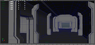
Quick example modular level section, built with only the modular assets shown in previous post. this was constructed in about 30-45mins. really quick and effective method to creating the basic outline of indoor enviornments.

Brought the corridor into UDK for simple snapping test, the grid settings and powers of 2 usage worked fine and the pieces snap together perfectly in UDK. lighting here is a bit off, it wasn't my focus for this test, i was primarily testing the modular snapping and building.
Modular assets
Just sketched up some ideas from my head of how i might use and break apart my environment into modular assets. nothing to detailed or fancy, just to give me rough idea to work from.
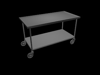
Modular assets creations for environment. testing at the moment for different methods of snapping and clipping.
interesting effect
Sunday, 25 November 2012
Onwards and ...somewhere.
Idea's of the enemy A.I and mechanics have now become an area of interest so to begin the visions of each enemy will be different, the ghosts will have a full 360 alert when stepping within the interest zone in which it is alerted and slowly progresses towards your position if it is truly an enemy, to tell friends from foe the idea fo a colour code has been thrown in which n alert will alter it to 1 of 3 colours red = enemy, green = devious (trickster, possibly a bit of both), blue signals friend although a ghost will instantly know you around it a mutant/native creature will not, it will have a narrow line of sight so it makes it easy to pass them by but not too easy, push onwards into the danger zone (red) and it will instantly know you are there in this case the player can run of fight.
below a concept of the ghost beings and it's enraged face.
Thursday, 22 November 2012
Early Texture Tests
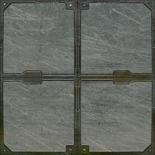
Painted out grey scale architectural texture detail.
Then used 2 stock textures which i applied to the painted greyscales to create my diffuse texture.
This is the final diffuse result of the roof, floor and wall. they all tile well. the wall texture works by flipping the U in UDK to make a full wall.
I took the grey scale digital paints i did and used them to create the normal and specular maps using Ndo2
once i had my diffuse, specular and normal maps i brought them all into UDK and set up a test corridor and applied the textures. they looked quite good, the only issue i may point out is that the wall texture shows seems due to the specular and the 2 piece set p i did for it using 2 seperate BSP walls, the specular stops sharply at the edge of the BSP, but as the walls will be created using custom static meshes this should be much of a problem once i get the specular maps to tile on the edges aswell.
Level concept development
The next two stages of the level, after reaching the bottom of the first elevator you are given a visual scene (undecided) behind a lite room and lead out into and hallway which is when the true horror begins.
First run through, testing for lighting and sound.
First run through of level with basic sound in place and lighting in first room. alot to change as of yet, everything still needs working on.
Tuesday, 20 November 2012
Friday, 16 November 2012
Sound
I looked into getting basic sound into the game as a horror game it is going to be an important factor. this here is just a very basic sound cue which loops once and has been set-up in kismet as a trigger event in which the player will trigger by walking into the volume. also i added a ambient looping sound to the ice cavern which attenuates as you leave and enter the facility, its a soft wind to give the ice cavern a more cold feel, also the cave will be much more vastly open in the final build so the open space creates these soft wind effects.
Lighing
Trying to get the look and feel of the lighting right, i spent alot of time with trial and error to get the lights looking acceptable for our horror game, i wanted the lights to be fairly bright but also leave dark shadowed areas, that have dim ambience so players can just about make out shapes in the darkness. for some lights like in the ice cave a little bloom i thought looked realistic because of the misty look the cave will have and the light shafts would be seen through the mist.
I have a flickering spotlight in place for the center of the room to create a more horror feel and because the facility is worn and torn the lights are going to be a bit glitchy so flickering lights not only add a boost to the horror factor but also the realism of the facility.
The textures in place here (apart from the ice cavern) are UDK's stock textures that i used to give the room a feel with the lighting set-up, the textures looked worn and grundgy so it suited the horror feel nicely, the whole scene helps get a good feel across early on how the lighting and level will look.
Thursday, 15 November 2012
Weapon development
weapon development from sketched idea's to a couple of finished designs, ended up choosing the ice pickaxe that's used for mountain climbing opposed to the pick that is used to flat land trekking, also a pipe to show in level and environment interaction (pick up) also a combat knife for quick stab encounters
Friday, 9 November 2012
stances and swings
twirling baseball bat http://www.youtube.com/watch?v=tJx9gH9NJeQ&feature=player_detailpage
sideways swing http://www.youtube.com/watch?v=NrpyBrbu8co&feature=player_detailpage
six steps http://www.youtube.com/watch?feature=player_detailpage&v=P1a_T1SKqzM
pipe swing www.youtube.com/watch?v=gswDny2bCq4&feature=player_detailpage
axe swing www.youtube.com/watch?v=GY-Gv9nMijs&feature=player_detailpage
shanghai noon http://www.youtube.com/watch?feature=player_detailpage&v=y3UO7DtqbnY
tomahawk training http://www.youtube.com/watch?v=MOeB2yMU_q8&feature=player_detailpage
last of the mohicans http://www.youtube.com/watch?v=XISEfGV6-70&feature=player_detailpage
Asset development
The beginning of the asset developmebnts starting with the beginning area sled design, showing first signs of horror and a hint to what has just happened to the player.
Subscribe to:
Posts (Atom)


.jpg)


.jpg)


